
Because of smartphone apps like Uber, taxi politics have gotten a lot of press lately. One of the claims Uber proponents make is that normal taxis do not serve everybody.
In New York City, taxis are heavily regulated. There are only about 14,000 taxis allowed to pick up passengers off the street in the center of the city. Uber gets around this regulation by only picking up passengers who request a ride on the app.
Because there are few taxis, critics say that they can get away with only serving the few. Some claim that taxis only serve those with the privilege to live in the city center, and that they are biased against people of color.
As a New Yorker who has spent my fair share of time waiting in taxi traffic on my bicycle, I wanted to get some understanding about this issue. Are taxis actually unfair, as critics claim?
Each colored polygon represents a census tract, with its color corresponding to the number of taxi cab drop offs that occurred within it in 2013.
Methodology
I looked at the locations where taxis drop off passengers. Then I looked to see if the locations correlate with demographic data about residents.
The drop off location data comes from the GPS in the taxi’s meter. This data is recorded by the Taxi and Livery Cab Commission, which is nice enough to publish it on its website.
The demographic data comes from the United States Census Bureau. They group NYC into about 2,000 regions called census tracts that usually span a few city blocks. The data they gather includes race, age, commute mode, and income, among others.
Assigning a census tract to each GPS drop off point is no easy task. It’s a computationally intensive job that I did using PostGIS. PostGIS has an efficient algorithm just for this job, but even with that, it would have taken too long for my laptop to match all 150 million drop offs.
Instead, I found the census tract of every point on a grid that divides the city into increments of one one-thousandth of a degree. Then, I could find the tract of a drop off GPS point just by rounding to the nearest one thousandth of a degree. This reduced the work the computer needed to do by a factor of ten.
A lesson I learned here: want practice using some “big data” techniques without having to actually get lots of data? Use a really old computer on a moderate amount of data.
A little note about the data: I removed Staten Island. For those not familiar with NYC geography, Staten Island is the island on the lower left of the map. It is economically, demographically, and culturally distinct from the rest of New York City. Even Staten Islanders agree: in 1993 they passed a referendum to secede from the city. The state of New York may have ignored them, but I respect the wishes of the residents and have seceded them from my analysis.
Results
I found that the per capita income of residents is good at predicting the number of taxi drop offs. I did a Poisson regression and found that the number of dropoffs per resident is proportional to the square of per capita income.
While it looks like there is room for improvement in my model, it might be impossible to improve it significantly. I may be able to improve the model by adding more demographic factors, but my initial analysis says that it won’t make a significant improvement. It could be that a non-demographic factor would make a big improvement. I would imagine that looking at the number of employees who work in a census tract would improve the model. It also could be that there are too many significant factors that are immeasurable. Popular locations like Central Park and Penn Station may attract people at significant rates. Directly measuring the number of people that travel to an area every day isn’t possible.
This model is far from perfect. While it does do an impressive job considering it uses only one variable, it indicates that there is a lot more to the story than just income.
But it’s important to keep in mind that dropoffs do not necessarily represent residents. Something tells me that the 25 residents of Central Park didn’t take 84,807 taxi rides each in 2013. There are many popular destinations within the city that attract people from everywhere, and their popularity may attract a disproportionate amount of wealthy residents.
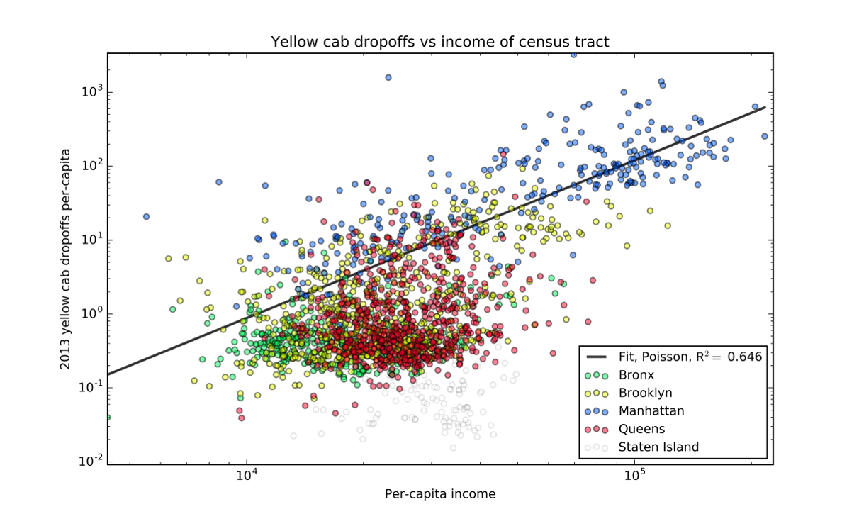
The per-capita income of a census tract does seem to be a significant factor in predicting the number of dropoffs in the area. It gets about 65% of the way to explaining everything. For those of you who are familiar with regression, \(R^2=0.65\).
I, for one, find the simplicity of this model appealing: per capita drop offs are proportional to the square of per capita income. While there are clearly more details, the simple take away here is quite satisfying.
Does this mean that rich people take more taxis? Not necessarily. But there are definitely a lot more taxis dropping off passengers in richer neighborhoods than poorer ones. That may be because the rich tend to live in popular neighborhoods, but it’s also clear wealthier residents have more access to taxis and are probably using taxis at a much higher rate.
This also provides a test for Uber. If the app really is more equitable, than they should have a lower power in the relationship between drop offs and income. It may be that Uber drop offs are directly proportional to income, rather than proportional to the square of income. If that were the case, it’d show that Uber’s usership is more balanced in income than ordinary yellow cabs.
Where you can find everything: The code used for this analysis can be found in my GitHub repository. You can find the taxi trip data on NYC’s nice taxi data website. There are oodles of places you can find census data, but my favorite is nhgis, which has a nice interface for searching and downloading just the columns you need.